Frost & Fruit Ice-Cream Branding
Case Study:
While designing the 'Frost and Fruit' brand, we carefully considered a crucial challenge it might encounter—failing to communicate the distinctive essence of the brand and its intended audience to users
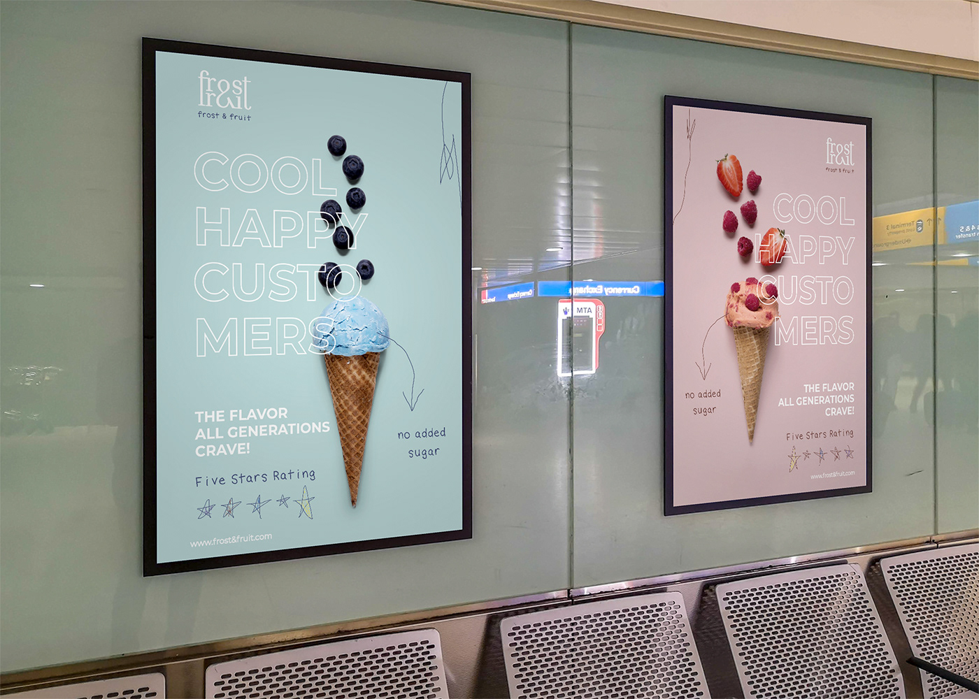
Their Point of variation is that their ice-cream contain no added sugars or artificial sweeteners, it's a treat that celebrates health and happiness for kids.
Solution:
We formulated the concept as 'kids' drawings' to encapsulate the intended audience of the brand. Our emphasis was on customizing drawings, fonts, and visual graphics to reinforce this concept. As we also used vibrant and bright colors to draw the attention of both kids and parents.
Brand Details:
Frost & Fruit general style is colorful, and joyful. We created a LogoType, Secondary Logo, Logo Mark, Pattern, and fully customized drawings for the package designs, wrapping papers, and advertising posters for exposure.


For The Posters, we still showcased kids' drawing and handwriting font to stick to who this brand is for.